
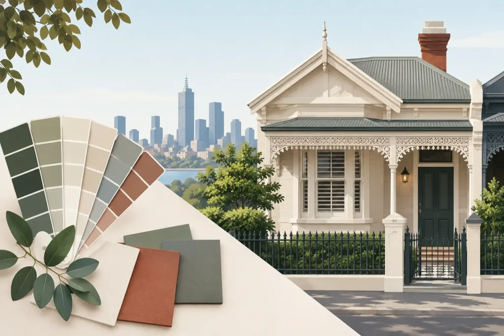
A heritage repaint can lose its character before the first brush touches the wall. Choosing a bright modern white for a Victorian verandah, or a near-black trim colour on a weatherboard cottage, may look tidy at first but can sit awkwardly against the building’s era. This heritage colour selection guide explains how Melbourne property owners can make colour decisions that respect the original architecture while delivering a durable, practical finish.
Heritage colour selection is not about turning every property into a museum piece. It is about understanding the building, its streetscape and the materials that give it character. The right scheme can sharpen original details, protect the property’s value and help avoid costly changes after work has begun.
Start with the building, not the paint chart
The age and architectural style of a property should lead the selection process. Melbourne’s Victorian, Edwardian, Federation, Californian bungalow and interwar homes each have recognisable proportions, joinery and decorative features. Colours that suit one period do not always translate well to another.
Victorian homes often carry stronger contrast between walls, trims and ornamental details. Deep greens, reds, creams, stone shades and restrained blues can work well when used in the right balance. Edwardian and Federation schemes generally move towards softer, earthier colours, with warm off-whites, olives, muted greens and terracotta tones. Californian bungalows tend to suit grounded natural colours that complement brick, timber and tiled roofs.
That does not mean every colour must be a literal historical match. Paint technology, surrounding development and the way people use homes have changed. The aim is to choose colours that feel appropriate to the period and make the best of the building’s original fabric, rather than applying a generic palette that could belong anywhere.
Read the exterior as a complete scheme
A heritage façade is made up of more than walls and window frames. Timber fretwork, cast-iron lacework, gables, verandah ceilings, balustrades, front doors, brickwork, roof tiles and masonry each affect how a colour scheme reads from the street.
Before selecting colours, identify which elements are structural, which are decorative and which should recede. On an ornate Victorian terrace, for example, a carefully selected contrasting trim can define the lacework without making it appear busy. On a simpler Edwardian weatherboard home, too many accent colours can make the façade feel fragmented.
As a practical rule, most schemes work best with a main body colour, a trim colour and one or two carefully controlled accent colours. The front door may provide the strongest accent, while verandah details or window sashes can carry a secondary tone. More colours may be historically suitable for highly decorative buildings, but they need to be planned with care.
Consider existing materials first
Original brick, bluestone, terracotta roof tiles and stained timber cannot be ignored. These materials have undertones that can clash with otherwise attractive paint colours. A cool grey may look clean on a sample card but feel stark beside warm red brick. Similarly, a creamy white can turn yellow next to bluestone or a charcoal roof.
Look at the fixed materials in natural daylight, then choose paint colours that sit comfortably beside them. If the home has original masonry or timber features worth retaining, they should guide the palette rather than be treated as an afterthought.
Check heritage controls before finalising colours
Not every older home is heritage listed, but many Melbourne properties sit within heritage overlays or precincts with planning controls. These requirements can affect visible external changes, including colour choices in some locations. The level of control varies between councils and individual properties.
Owners, body corporates and commercial property managers should check the relevant planning requirements early, particularly where the work involves a prominent façade, apartment block exterior or streetscape-facing commercial building. Waiting until painters are booked can create delays, additional administration and avoidable repainting costs.
For strata and managed properties, colour selection also needs agreement from the committee or owners corporation. A documented schedule covering walls, trims, doors, metalwork and common areas helps prevent confusion now and makes future maintenance far more consistent.
Test colours where they will actually be seen
Small paint chips are useful for narrowing options, but they are not enough for a final decision. Light changes significantly across Melbourne’s seasons and even across one day. A colour that appears soft and neutral on a showroom card may look much darker on a south-facing wall or overly bright in full afternoon sun.
Apply generous sample patches to different sections of the façade. Review them in the morning, at midday and late in the day. Check the colours beside rooflines, gutters, brickwork and existing landscaping. For a commercial or strata building, view samples from the street as well as close up, because large surfaces can make a colour appear stronger than expected.
It is also worth testing sheen. A high-gloss finish can highlight decorative timberwork, but it will show surface imperfections more readily. Lower-sheen coatings often give weatherboards and broad wall areas a more forgiving appearance. The right choice depends on the substrate condition, exposure and the level of architectural detail.
Balance historical character with maintenance demands
A suitable heritage palette still needs to work in real conditions. Melbourne homes and buildings face UV exposure, rain, wind, traffic grime and changing temperatures. Dark colours can absorb more heat, which may place additional stress on some timber elements. Very pale colours can show dirt and staining more quickly, especially near busy roads or under eaves where rain does not wash surfaces evenly.
This does not rule out dark trims or light walls. It means the preparation, coating system and maintenance plan need to suit the colour choice. Failing paint, open joints, damaged putty and deteriorated timber should be repaired properly before repainting. A carefully chosen period colour will not compensate for poor substrate preparation.
For heritage timberwork, thorough preparation is often the difference between a finish that lasts and one that starts peeling early. Scraping unstable coatings, sanding, priming bare areas and sealing gaps all matter. On older properties, the scope may also include careful restoration of sash windows, verandah posts, fascia boards and ornamental timber.
Avoid common heritage colour mistakes
The most frequent mistake is selecting colours in isolation. A wall colour might be appealing on its own but fail once paired with roof tiles, paving, brickwork and neighbouring façades. The second is using too much contrast. Strong contrasts can look effective on selected Victorian details, yet they can overpower a modest cottage or bungalow.
Another issue is painting original materials unnecessarily. Unpainted brick, bluestone and timber details often contribute strongly to heritage value. Once painted, they generally require ongoing maintenance and can be difficult to restore to their original appearance. Where these surfaces are sound, retaining them may be the better long-term decision.
Finally, avoid relying solely on what is currently fashionable. Warm whites, charcoal trims and black doors may suit contemporary homes, but heritage work benefits from a slower, more considered approach. A colour scheme should still look right when trends have moved on.
A practical heritage colour selection guide for shared buildings
For apartment complexes, schools, offices and commercial properties, heritage colour selection needs to account for more than architectural style. Access requirements, staging, occupant safety and continuity of operations all affect the project. The colour schedule should be clear enough for work to be completed in stages without creating visible inconsistencies.
A professional painting team can assess substrate condition, identify repair needs and prepare a schedule that separates original features from later additions. This is particularly useful where previous repainting has obscured period details or introduced mismatched colours over time.
The Scotsman Painters approaches heritage painting with the same focus required on any well-managed site: proper preparation, qualified tradesmen, safe access and a finish that holds up. For owners and managers, that means colour decisions can be tied to a realistic scope, programme and budget rather than treated as a purely decorative exercise.
A heritage colour scheme should make a building look settled in its surroundings, not freshly forced into a style that does not belong. Take the time to inspect the original details, test colours in changing light and confirm any planning requirements before work begins. That care at the selection stage gives the finished paintwork every chance to look right for years to come.